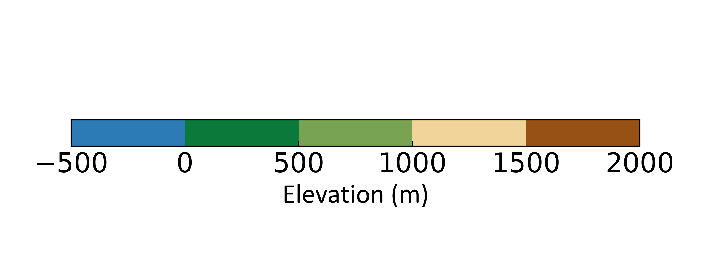
Create a discrete colour bar (Python)
When making maps or plots of spatial data (or any data really), colour bars are an almost standard requirement. For the map making process, I tend to create my basic map in ArcMap or QGIS, touching it up in a vector editing package later on (e.g. Inkscape). When considering a colour scheme to use and the audience to which you will be presenting, choosing the correct colours is important - you have to ask questions like:
- is this suitable for those who are colour-blind?
- will this colour scheme work for printing?
Fortunately, colorbrewer has got you covered - if you haven’t visited the website do so now and thank me later :) Furthermore, on choosing colour schemes in say QGIS, many of the colour palettes in colorbrewer are implemented. If not, you can use the HEX, RGB or CMYK codes to set your map colours specifically.
A particularly time consuming element I find is creating a visually pleasing and clear colour bar. Perhaps this is largely to my dislike of the colour bars that come along with Arc and QGIS. The approach detailed below allows you to specifically set your ticks and the colours for each category using Python’s matplotlib.
For this example, say we have a range of values from -500 to 2000 m, with an interval of 500 m. That is 6 values, representing 5 categories (i.e. -500 – 0, 0 – 500 … 1500 – 2000). We are going to create a horizontal colour bar. To begin, we are going to import some elements from matplotlib:
import matplotlib.pyplot as plt
import matplotlib as mpl
Non-essential but if you want to specifically set the font size and type, you can temporarily overwrite you matplotlib rc settings like this:
mpl.rcParams.update({'font.size': 22})
hfont = {'fontname':'Calibri'}
We’ll now make a figure object - we are making a figure that is 8 in wide and 3 in tall (this would be ideal if you were wanting the colour bar for an A1 or A0 poster for example).
fig=plt.figure(figsize=(8,3))
ax=fig.add_subplot(111)
Now we create a list of our values:
vals=[-500,0,500,1000,1500,2000]
Next is to create a ListedColormap object, which contains the information of the colours we want to display in our colourbar.
cmap = mpl.colors.ListedColormap(['#2c7bb6','#0a793a','#77a353','#f1d499','#c96a33','#975114'])
As we want a discrete colour bar, we have to set the colormap index (which is normally set to an interval of 0 – 1). To create the BoundaryNorm object, pass it the vals list and the number of colours, which can be accessed from the ListedColormap object we just created:
norm = mpl.colors.BoundaryNorm(vals, cmap.N)
Now it’s time to create the colorbar proper:
cb = mpl.colorbar.ColorbarBase(ax, cmap=cmap,
                                norm=norm,
                                spacing='uniform',
                                orientation='horizontal',
                                extend='neither',
                                ticks=vals)
To tidy it up, we’ll label it and set the position of the ax within the fig object so it is approximately centre:-
cb.set_label('Elevation (m)', **hfont)
ax.set_position((0.1, 0.45, 0.8, 0.1))
You can then save it or display it:
plt.savefig("./colourbar.png", dpi=300, transparent=True)

#or

plt.show()
You should have something like this:

If you want a vertical colour bar, adapt a few of the calls above and use these:
# Vertical settings

fig=plt.figure(figsize=(3,8))

cb = mpl.colorbar.ColorbarBase(ax, cmap=cmap,
                                norm=norm,
                                spacing='uniform',
                                orientation='vertical',
                                extend='neither',
                                ticks=vals)


cb.set_label('Elevation (m)', rotation=-90, labelpad=20)
ax.set_position((0.45, 0.1, 0.1, 0.8)